

Market Basket Analysis of The Bread Basket Bakery
So what exactly is a Market Basket Analysis (or MBA)?
Simply put, it is a modelling technique based upon the theory that if you buy a certain group of items, you are more (or less) likely to buy another group of items. We can use MBA to uncover interesting associations between different products, resulting in a series of product association rules. The dataset we are going to analyze belongs to “The Bread Basket”, a bakery that serves fresh breads, desserts, cakes, as well as hearty lunch meals.
MBA Recommendations to Increase Profitability
1) Increase sales of
Mighty Proteinby offering $2 off with a purchase of a coffee2) Only stock
Afternoon with the Bakeron Friday through Sunday3) Increase marketing of
Fudgeleading up November and December
Concept of Association Rule Mining

There are three main criteria to evaluate the quality and strength of the association rules generated by MBA. These are Support, Confidence, and Lift:
Support
Support is the percentage of transactions that contain the specific combination of products relative to the total number of transactions.

Confidence
Confidence is an indication of how often the association rule is found to be true.
Lift
Lift is the ratio of the observed support that is expected if X and Y were independent.
Each criterion has its advantages and disadvantages, but a good rule of thumb is to select association rules with high support, high confidence, and high lift.
In summary:
Confidence = P(B|A)
Support = P(AB)
Lift = P(B|A)/P(B)
Data Preprocessing
Loading the Required Libraries
library(dplyr)
library(tidyr)
library(chron)
library(ggplot2)
library(tsbox)
library(arules)
library(arulesViz)
library(treemapify)
library(gridExtra)
library(tidyverse)
Examining the Bread Basket dataset
dat <- read.csv("BreadBasket_DMS.csv")
> head(dat)
        Date     Time Transaction          Item
1 2016-10-30 09:58:11           1         Bread
2 2016-10-30 10:05:34           2  Scandinavian
3 2016-10-30 10:05:34           2  Scandinavian
4 2016-10-30 10:07:57           3 Hot chocolate
5 2016-10-30 10:07:57           3           Jam
6 2016-10-30 10:07:57           3       Cookies

> print(paste0("Data contains ", dim(dat)[1], " observations with ", length(unique(dat$Transaction)), " distinct transactions."))
[1] "Data contains 21293 observations with 9531 distinct transactions."

> summary(dat)
         Date             Time        Transaction        Item
 2017-02-04:  302   12:07:39:   16   Min.   :   1   Coffee :5471
 2016-11-05:  283   10:45:21:   13   1st Qu.:2548   Bread  :3325
 2017-03-04:  265   10:55:19:   13   Median :5067   Tea    :1435
 2017-03-25:  254   14:38:01:   13   Mean   :4952   Cake   :1025
 2017-01-28:  243   13:43:08:   12   3rd Qu.:7329   Pastry : 856
 2017-02-18:  240   14:19:47:   12   Max.   :9684   NONE   : 786
 (Other)   :19706   (Other) :21214                  (Other):8395


 > sapply(dat, function(x){class(x)})
       Date        Time Transaction        Item
   "factor"    "factor"   "integer"    "factor"
Cleaning the data
Before we can delve into the analysis, we first need to clean up the data.
First, we need to convert the While there are no missing values, several “Item” observations include a “NONE” value which need to be removed. Lastly, we’ll extract the weekday from the date Click here for complete code for data preprocessing
Date and Time variables into useable formatsdat$Date <- as.Date(dat$Date, format = "%Y-%m-%d")
dat$Time <- chron(times=dat$Time)
> sapply(dat, function(x){sum(is.na(x))})
       Date        Time Transaction        Item
          0           0           0           0

dat <- filter(dat, Item != "NONE")
dat <- dat %>% mutate(Day = factor(weekdays(dat$Date, abbreviate = T),
                                   levels = c("Mon", "Tue", "Wed", "Thu", "Fri", "Sat", "Sun")))
Data Exploration
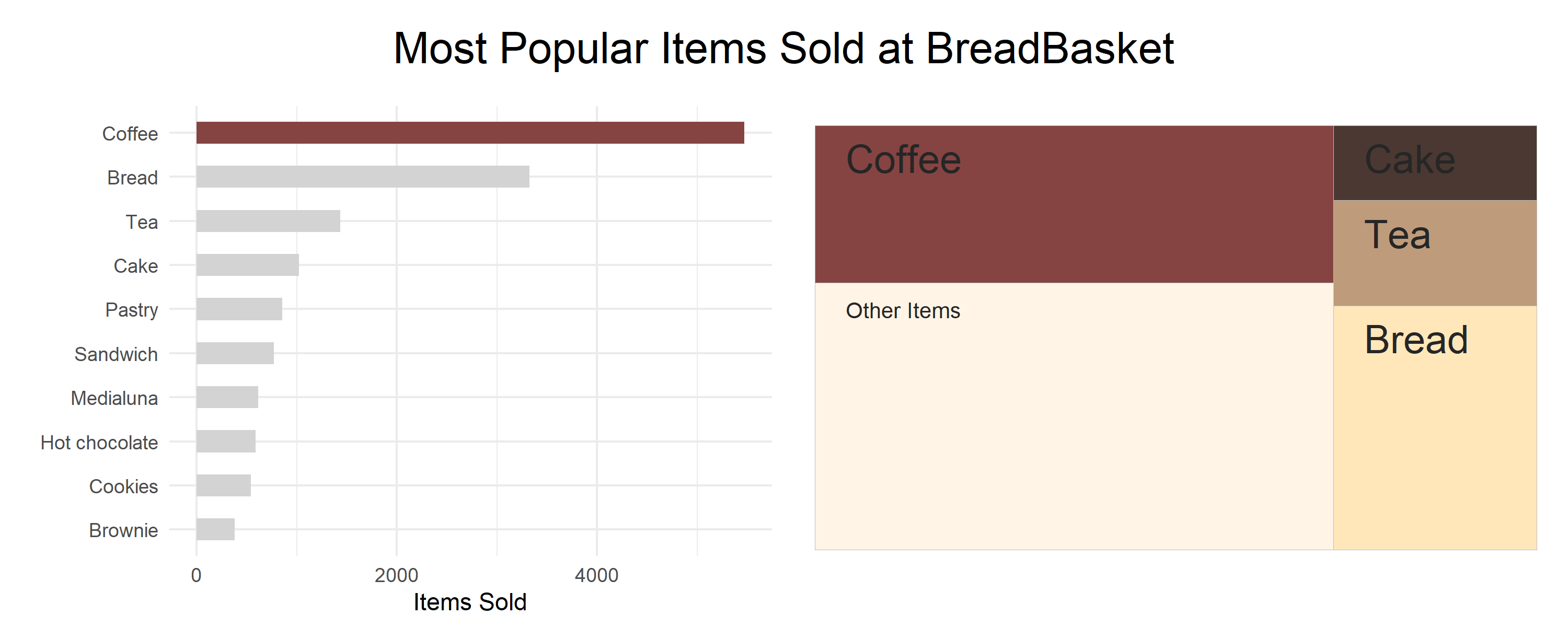
Top Selling Products
The first question we can ask is: “What are the top-selling products at The Bread Basket?”
top_items <- dat %>% count(., Item, sort=T) %>%
  head(10) %>% arrange(desc(n)) %>%
  mutate(Color_highlight = c("A", rep("B",9))) %>%
  mutate(Item = factor(Item, levels = rev(Item)))

top_items_bar <- ggplot(top_items, aes(x = Item, y = n, fill=Color_highlight)) +
  geom_bar(width = 0.5, stat="identity") +
  theme_minimal() + ylab("Items Sold") + xlab("")+
  scale_fill_manual(values=c("#854442", "lightgrey"), guide=F) +
  coord_flip()

top_items_treemap <- dat %>% count(., Item, sort=T) %>% head(4) %>%
  add_row(Item="Other Items\n\n\n\n\n\n\n\n\n", n=9251)

top_items_tree <- ggplot(top_items_treemap, aes(area=n, fill=Item)) + geom_treemap(start="bottomleft") +
  geom_treemap_text(label=top_items_treemap$Item, start="bottomleft", col="grey15",
                    padding.x = grid::unit(5, "mm"), padding.y = grid::unit(3, "mm")) +
  scale_fill_manual(values = c("wheat1", "#4b3832", "#854442", "#be9b7b", "#fff4e6"), guide=F) +
  theme(plot.margin = margin(0.5, 0.5, 1.25, 0.5, "cm"))

top_items_plots <- grid.arrange(top_items_bar, top_items_tree, ncol=2,
                                top = textGrob("Most Popular Items Sold at BreadBasket",gp=gpar(fontsize=20)),
                                padding = unit(2, "line"))
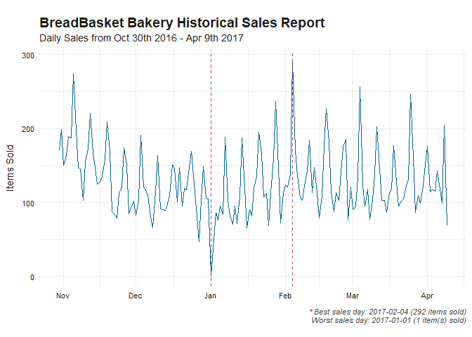
Historical Daily Sales
Next, we’ll analyze the sales records of BreadBasket across various time periods.
daily_ts <- dat %>% count(., Date)
worst_day <- daily_ts %>% slice(which.min(n))
best_day <- daily_ts %>% slice(which.max(n))


daily_ts %>%
  ts_df() %>%
  ts_ggplot(title = "BreadBasket Bakery Historical Sales Report",
            subtitle = "Daily Sales from Oct 30th 2016 - Apr 9th 2017",
            ylab="Items Sold") + theme_tsbox() +
  geom_line(col='deepskyblue4') +
  geom_vline(xintercept = as.Date(c(daily_ts %>% slice(which.min(n)) %>% pull(Date),
                                    daily_ts %>% slice(which.max(n)) %>% pull(Date))),
             col='deeppink4', lty=2, alpha=0.75) +
  labs(caption=paste0("\n* Best sales day: ", best_day %>% pull(Date), " (", best_day %>% pull(n), " items sold)",
                      "\nWorst sales day: ", worst_day %>% pull(Date), " (", worst_day %>% pull(n), " item(s) sold)")) +
  theme(plot.caption = element_text(size=6, face="italic", color="grey25"))
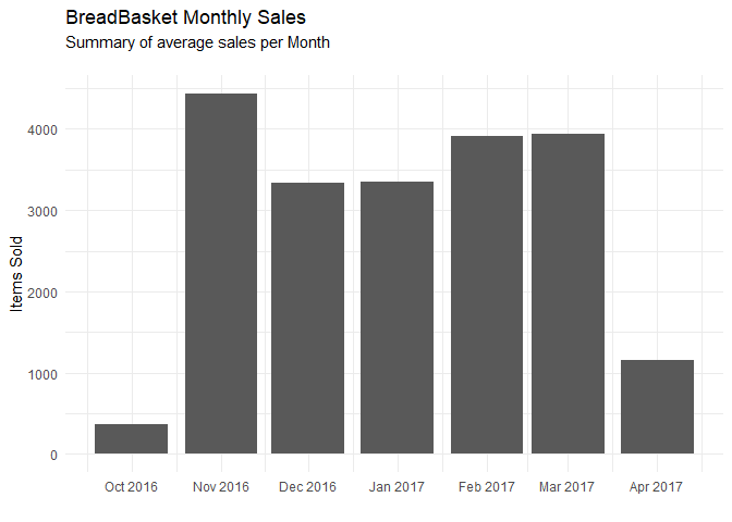
Total Monthly Sales
dat %>%
  mutate(Month = format(as.Date(Date), "%Y-%m")) %>%
  group_by(Month) %>% count(., Item) %>% ungroup() %>%
  mutate(Month = as.Date(paste0(Month, "-01"))) %>%
  ggplot(aes(x=Month, y=n)) + geom_bar(stat='identity') +
  scale_x_date(date_labels = "%b %Y", date_breaks = "month") +
  theme_minimal() + labs(title = "BreadBasket Monthly Sales",
                         subtitle="Summary of average sales per Month\n") +
  ylab("Items Sold") + xlab("")
Average Sales by Day of the Week
dat %>% count(., Day) %>%
  mutate(Color_Column = c(rep("B",5),"A","B")) %>%
  ggplot(aes(x=Day, y=n, fill=Color_Column)) + geom_bar(stat = 'identity') +
  theme_minimal() + labs(x="", y="Items Sold", title='BreadBasket Daily Sales',
                         subtitle="Summary of average sales per day\n",
                         caption="* Tukey's test, p< 0.001 for all pairwise comparisons\n") +
  geom_text(x=6, y=4750, label="***") +
  scale_fill_manual(values=c("#854442", "lightgrey"), guide=F)
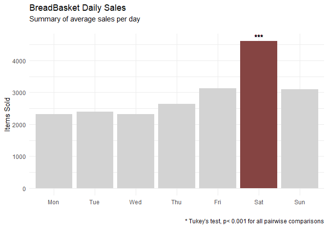
No analysis is complete without statistical testing, so let’s confirm the that Saturdays are indeed the highest grossing day of the week by conducting a Tukey’s HSD test for multiple comparisons.
tukey_df <- dat %>% group_by(Date) %>% count(.,Day)

> TukeyHSD(aov(n~Day, data=tukey_df))$Day %>% as.data.frame %>%
    rownames_to_column("Pairs") %>%
    filter(stringr::str_detect(Pairs, 'Sat'))

      Pairs      diff       lwr       upr        p adj
  1 Sat-Mon  89.55072  60.47469 118.62676 3.841372e-14
  2 Sat-Tue  96.21739  67.80986 124.62493 3.053113e-14
  3 Sat-Wed  99.30435  70.89681 127.71188 2.564615e-14
  4 Sat-Thu  85.17391  56.76638 113.58145 5.562217e-14
  5 Sat-Fri  64.39130  35.98377  92.79884 5.413278e-09
  6 Sun-Sat -65.65217 -94.05971 -37.24464 2.668662e-09
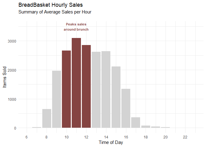
Average Hourly Sales
dat %>%
  mutate(Hour = hours(Time)) %>% count(Hour) %>%
  mutate(Color_Column = c(rep("B",4), rep("A",3), rep("B",11))) %>%
  ggplot(aes(x=Hour, y=n, fill=Color_Column)) + geom_bar(stat='identity') +
  geom_text(x=11, y=3500, label = "Peaks sales\naround brunch", col="#854442", check_overlap = T,
            fontface = 2, size=3) +
  theme_minimal() + labs(title = "BreadBasket Hourly Sales",
                         subtitle="Summary of Average Sales per Hour\n") +
  ylab("Items Sold") + ylim(c(0,3500)) +
  scale_x_continuous(breaks = c(seq(6,23,2)), labels=c(seq(6,23,2)),
                     limits = c(6,23), name = "Time of Day") +
  scale_fill_manual(values=c("#854442", "lightgrey"), guide=F)
Market Basket Analysis
Now let’s get into the crux of the analysis: The Market Basket Analysis (or MBA for short). First, we need to convert our data from single observations into a transaction format.
dat_itemlist <- dat %>%
  group_by(Transaction) %>%
  mutate(ItemList = paste0(Item, collapse = ",")) %>%
  as.data.frame()

# Set unused columns to NULL
dat_itemlist[,c("Date", "Time", "Transaction", "Item", "Day")] <- NULL

# Write the resulting dataframe into a csv file
write.csv(dat_itemlist,"Bakery ItemList.csv", quote = FALSE, row.names = FALSE)

# Load the csv file in a transactional format
tr <- read.transactions('Bakery ItemList.csv', format = 'basket', sep=',')
This is what the transactional format looks like once it is loaded into R
> summary(tr)
transactions as itemMatrix in sparse format with
 20508 rows (elements/itemsets/transactions) and
 105 columns (items) and a density of 0.02507036

most frequent items:
 Coffee   Bread     Tea    Cake  Pastry (Other)
  11821    7089    3934    3173    2386   25582

element (itemset/transaction) length distribution:
sizes
   1    2    3    4    5    6    7    8    9   10
4298 6635 4811 2867 1257  415  128   38   49   10

   Min. 1st Qu.  Median    Mean 3rd Qu.    Max.
  1.000   2.000   2.000   2.632   3.000  10.000

includes extended item information - examples:
                    labels
1               Adjustment
2 Afternoon with the baker
3                Alfajores
Apriori Algorithm
Now that we have our data in a transactional format, we can build an apriori algorithm to uncover the association rules of the various items sold at BreadBasket.
basket_rules <- apriori(tr, parameter = list(supp=0.001, conf=0.8,maxlen=10))

# Since there are 90 rules, let's examine the top 10 rules
inspect(basket_rules[1:10])

# We can subset redundant rules
subset_rules <- basket_rules[-which(colSums(is.subset(basket_rules, basket_rules)) > 1)]

# Plotting the Association Rules
plotly_arules(subset_rules, jitter=15,
              colors=c("#003f5c", "#ff6361","grey85"))
Association Rule Exploration & Recommendations
Lastly, we’ll explore the association rules and explain how we came up with the previously mentioned recommendations.
Recommendation #1: Increase sales of Mighty Protein by offering $2 off with a purchase of a coffee
MightyProtein_analysis <- apriori(tr, parameter = list(supp=0.001, conf=0.8),appearance = list(default="rhs",lhs="Mighty Protein"))

> inspect(MightyProtein_analysis)
    lhs                 rhs      support     confidence lift     count
[1] {Mighty Protein} => {Coffee} 0.001316559 0.8709677  1.511023 27
A common sales tactic is to bundle one popular item with another product with a high margin. After exploring the association rules, we find that Mighty Protein, a fairly low-selling product with an assumed high profit margin exhibits a strong association with coffee, the most popular item at Bread Basket. This is evident by the high support and high confidence. By offering a discount on the Mighty Protein with the purchase of a coffee, we expect to see an increase in the total sales of Mighty Protein as well as an increase in lift.
Without the prices for each item, we cannot quantify the potential increase in profit using this tactic. However, using anecdotal evidence and experience with other bakery’s prices, we expect that a discount of $2 would be offset by the increases sales of the combo, and lead to an overall profit increase.
Recommendation #2: Only stock Afternoon with the Baker on Friday through Sunday
daily_item_sales <- function(x){dat %>% filter(Item == x) %>% count(., Day) %>%
   mutate(Color_Column = c(rep("B",4), rep("A",3))) %>%
    ggplot(aes(x=Day, y=n, fill=Color_Column)) + geom_bar(stat = 'identity', width=0.65) +
    theme_minimal() + ylab("Items Sold") +
    scale_fill_manual(values=c("#854442", "lightgrey"), guide=F) +
    labs(title = paste0("Item Analysis - ", x),
        subtitle = "Breakdown of Total Sales by Day\n")}

daily_item_sales("Afternoon with the baker")

hourly_daily_sales <- function(x){dat %>% filter(Item == x) %>%
    mutate(Hour = hours(Time)) %>%
    group_by(Day, Hour) %>% count(., Item) %>%
    ggplot(aes(x=Hour, y=n)) + geom_bar(stat="identity") +
    facet_wrap(~Day)+ xlim(7,23) +
    theme_bw() + ylab("Items Sold") +
    labs(title = paste0("Item Analysis - ", x),
         subtitle = "Breakdown of Total Sales by Day and Hour\n")}

hourly_daily_sales("Afternoon with the baker")
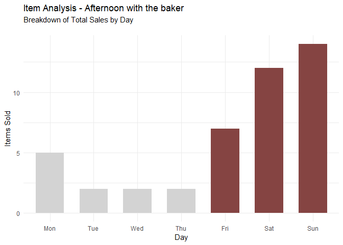
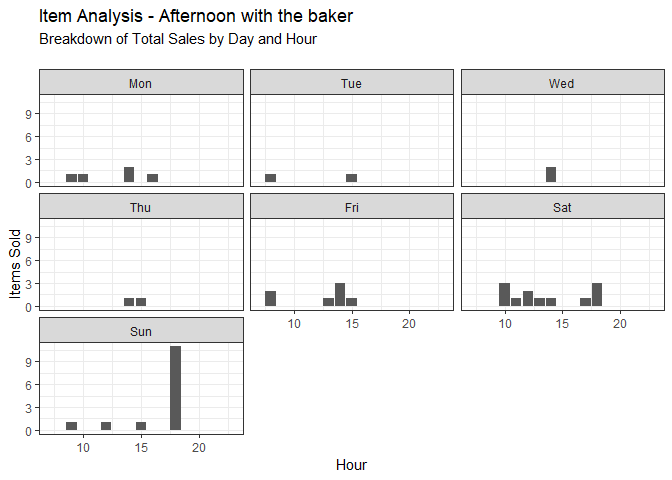
Most of the sales of Afternoon with the Baker occur between Friday and Sunday, with a non-neglible amount being sold on Monday. By limiting the sale to the weekends, we can reduce the cost associated with unsold merchandise and perhaps increase people’s perception of the item by marketing it as a special promotional item.
Note: While the majority of Afternoon with the Baker sales occur between Friday and Monday, a non-negligible amount are also sold on Mondays. Running a brick-and-mortar A/B test would conclude if it should also be made and sold on Mondays.
Recommendation #3: Increase marketing of Fudge leading up November and December
seasonality <- function(x) {dat %>%
    filter(Item == x) %>%
    mutate(Month = format(as.Date(Date), "%Y-%m")) %>%
    group_by(Month) %>% count(., Item) %>% ungroup() %>%
    mutate(Month = as.Date(paste0(Month, "-01"))) %>%
    mutate(Color_Column = c("B", rep("A", 2), rep("B",4))) %>%
    ggplot(aes(x=Month, y=n, fill=Color_Column)) + geom_bar(stat='identity') +
    scale_x_date(date_labels = "%b %y", date_breaks = "month",
                 limits = as.Date(c("2016-09-01", "2017-05-01")), name="") +
    theme_minimal() +
    ylab("Items Sold") +
    labs(title = "Seasonality of Fudge",
         subtitle = "Summary of Sales per Month\n") +
    scale_fill_manual(values=c("#854442", "lightgrey"), guide=F)}

seasonality("Fudge")
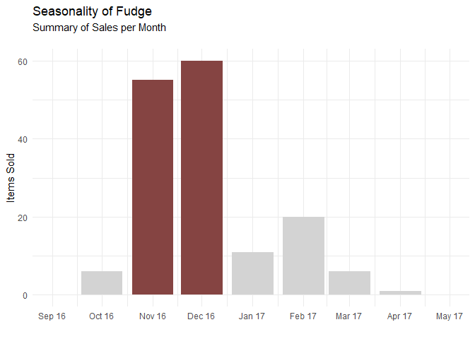
We can see from the graph above that Fudge is overwhelmingly bought during November and December, likely as the dessert of choice for the holidays. After all, what Thanksgiving or Christmas season is complete without rich, creamy fudge? Increasing marketing of fudge as a holiday special treat would increase sales, as would creating a new collection of Holiday Fudge, with flavours such as Eggnog Fudge, Gingerbread Fudge, Cranberry-Pistachio Fudge, Red Velvet Fudge, Hot Chocolate Fudge and more. Or simply add some sprinkles on top of the existing fudge recipe.
Happy rule mining! ☕🥐